

Talentyze
Talentyze is a modern recruitment website designed to simplify talent acquisition through a clean, user-friendly interface. The design focuses on clear messaging, structured service presentation, and strong visual hierarchy to build trust and guide users toward action. With a minimal aesthetic, strategic use of gradients, and well-placed CTAs, the website creates a seamless experience for both businesses and job seekers.
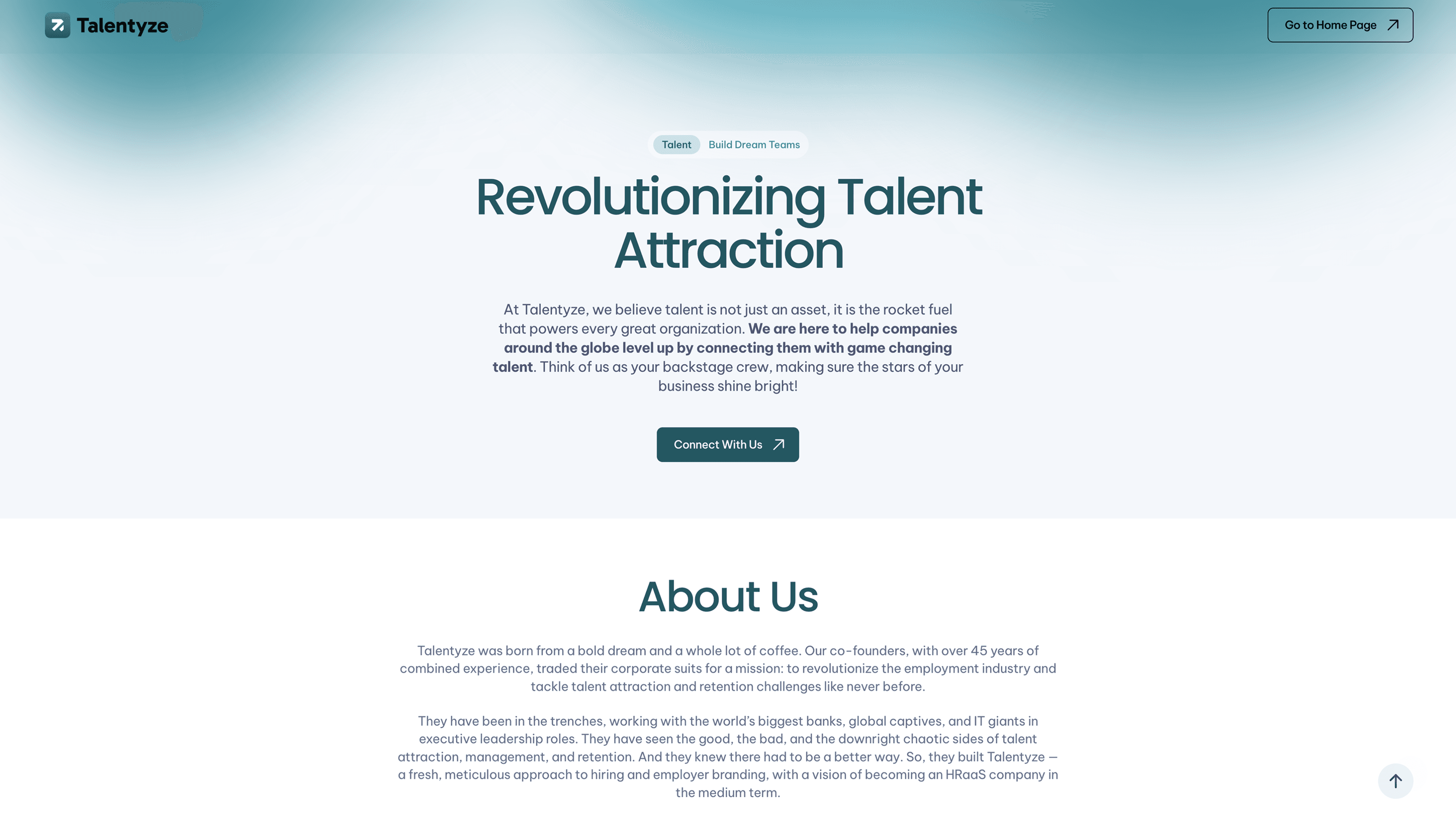
Talentyze Website UI Design – Revolutionizing Talent Attraction
To design a clean, modern, and user-centric website that clearly communicates Talentyze’s recruitment services, builds trust through strong messaging and visual hierarchy, and drives user engagement through intuitive navigation and strategically placed call-to-actions.
Recruitment services often involve jargon-heavy and overlapping offerings (RPO, talent search, employer branding, etc.). The challenge was to translate these complex services into simple, clear, and scannable content without losing meaning or credibility.
The brand needed to feel trustworthy and corporate, while also being approachable and engaging. Designing a UI that avoids being too rigid or too casual—through colors, typography, and tone—was a key challenge in creating the right balance.
Tackling the Problem
Complex services were broken down into simple sections, short descriptions, and icon-based cards, making information easy to scan and understand quickly.
A balanced color palette (teal + neutrals), clean typography, and ample whitespace were used to maintain professionalism while keeping the interface friendly and modern.
The layout was designed as a step-by-step journey (Hero → About → Services → Proof → CTA), with well-placed call-to-actions to smoothly guide users toward conversion without overwhelming them.

The Solution

Introduces the brand with a bold value proposition, supported by a clean layout and a primary call-to-action to immediately engage users.

Highlights the company’s background and expertise, building trust through experience and a human-centered narrative.

Presents the company’s long-term goals, mission and Manifesto in a visually distinct block to reinforce purpose and direction.

Showcases key offerings using structured cards and icons, making it easy for users to quickly understand available solutions.

Displays key achievements and statistics to establish credibility and reinforce trust through numbers.

Encourages users to take action with a strong message and prominent button, driving conversions.

Addresses common user questions in an accordion format, reducing friction and improving decision-making.

Provides essential information such as locations, legal details, and brand presence in a clean, minimal layout.


